Results from questionnaire:
Firstly, the main age range of my respondents were ages 16-20, which is ideal due to my target audience being within that age range, therefore their feedback will benefit me for making any changes. This age range are more likely to be interested in modern websites with graphics and bold colours, which my website uses.
Secondly, 10 out of 13 respondents were female. Stereotypically, females are interested in the colours pink, purple, yellow and baby blue, which I have used within my website layout. These colours are also conventions of the indie genre due to being natural colours, which are normally found within flowers and the colours in the sky for sunrises and sunsets. Also, females are the majority of the audience for romance genre films and music videos due to it being a fantasy and helping them escape from reality (Young and Rubicam - the struggler).
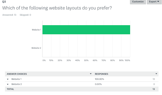
Furthermore, all of my respondents chose website one as the preferred layout and the average rating was 4 out of 5. This therefore helps me with understanding what the target audience expect within a website and the layout.
On average, majority of my audience said that the image and colour stood out on my website layout. This shows that the young generation are into bold colours and graphics within a website as it's eye-catching and gives a website a professional and modern style.
In addition, the images above show the respondents feedback on how to improve my website. Most respondents said that the text needs to be larger to be read easier and needs to match the image and have more of a italic font. Another respondent mentioned that the layout is too overcrowded, and the background colour should have a lower opacity so both the image and text are easier to see as it strains over the text. This shows that colour and style are key for my target audience as they still want to see the text and image, just at a lower saturation to be seen and read easier.
Therefore, I will make a few changes such as the size of the font as well as the opacity of the background image of the flowers. Also, I will try to change the layout of where the subheadings and the social media links are and try not to make it clash with the background.

Finally, my audience said that they expect to see social media links and a about page to give a summary about the production company and cast. I have already included these aspects within my website, therefore no changes are needed. However, two of my respondents mentioned that they expect to see all of the conventions listed. My website includes all of these aspects apart from a search bar, therefore I will include one so it gives the audience easier access to find their interests within my website.
In conclusion, I will slightly change the layout of my website. For example, the colour and size of the text and image to make it easier for the audience to see and read. To do this, I will change the opacity of the background image and change the colour of the font for the headlines and search bar. Also, I will change how some parts of my website is set out to make it look less overcrowded, therefore making it more aesthetically pleasing to the target audience.
Website 1: My opinion
Firstly, the first website is the main website which I am using due to it meeting more conventions of the Indie genre. For example, the variety of colours such as blue, green and pale orange and baby pink, connoting love, purity, growth and peace. The logo for Light Beams Productions has changed due to the grey background in the original logo design not blending in with the rest of the theme of the website. Therefore, I photoshopped the grey background to make a transparent background and the 'L' from black to pink, so the new logo will blend in as look professional on the website, and the pink 'L' will match the colour of the subheadings. Both, the background and logo, are aesthetically pleasing to the target audience (16-20 year olds) due to younger people liking brighter colours which persuades them to look at a media source.
Furthermore, have included subheadings which link to different pages of the website such as home, about, news, gallery and contacts. This will make the audience have easy access to the parts of the website which they want to access. It is also a simple and modern layout due to old websites having a lack of graphics and one main page of heavy text with simple links, which lead to other websites. Therefore, my audience will be intrigued with going through other parts of my website due to there being a lack of heavy text.
Website 2: My opinion
The second website was my first template in making a website. The theme is bland due to me using a grey background, which matches the grey background in my company logo, giving the website an anaesthetically pleasing look due to it looking like a business website rather than a music website. This is due to the lack of graphics and bold colours which are conventions of the indie genre due to the hippie culture having bright and bold colours, symbolising the 'flower power' and conventions of nature. The subheadings are set out similar to the subheadings on website 1, the text is yellow to symbolise the light beam in the company logo in the top corner of the website. Also, the rest of the text are grey and black due to symbolising the colours within the logo.


